The Spicewood Springs Branch is one of twenty libraries in the Austin Public Library system located in the northwestern part of Austin and home to the local Spicewood Springs community. After doing an extensive amount of research about and spending time at the Spicewood Springs Branch, I present to you my proposed visual identity for the Spicewood Springs Branch.
Project Summary:
Identify and pick a specific branch from the Austin Public Library system, and, for a semester, create and present a proposed visual identity about the branch of your choice.
For the proposed visual identity, I did research, which included photos, interviews, spending time at your branch, and online research was done. Creating a proposed brand strategy, wordmark, color palette, typography, graphics or illustrations, and brand extension was also done.
Process:
Research:
After identifying and deciding on the Spicewood Springs Branch, research was conducted, which included me going to the Spicewood Springs Branch to take photos inside & outside, observe the patrons, become a patron, and conduct interviews to get insight from employees and patrons about what they think of the branch and surrounding community. I also did some online research, looking into the history and basic information of the branch, reviews about the branch, and the surrounding area of the branch's location. Look into the surrounding community. More information can be found here.
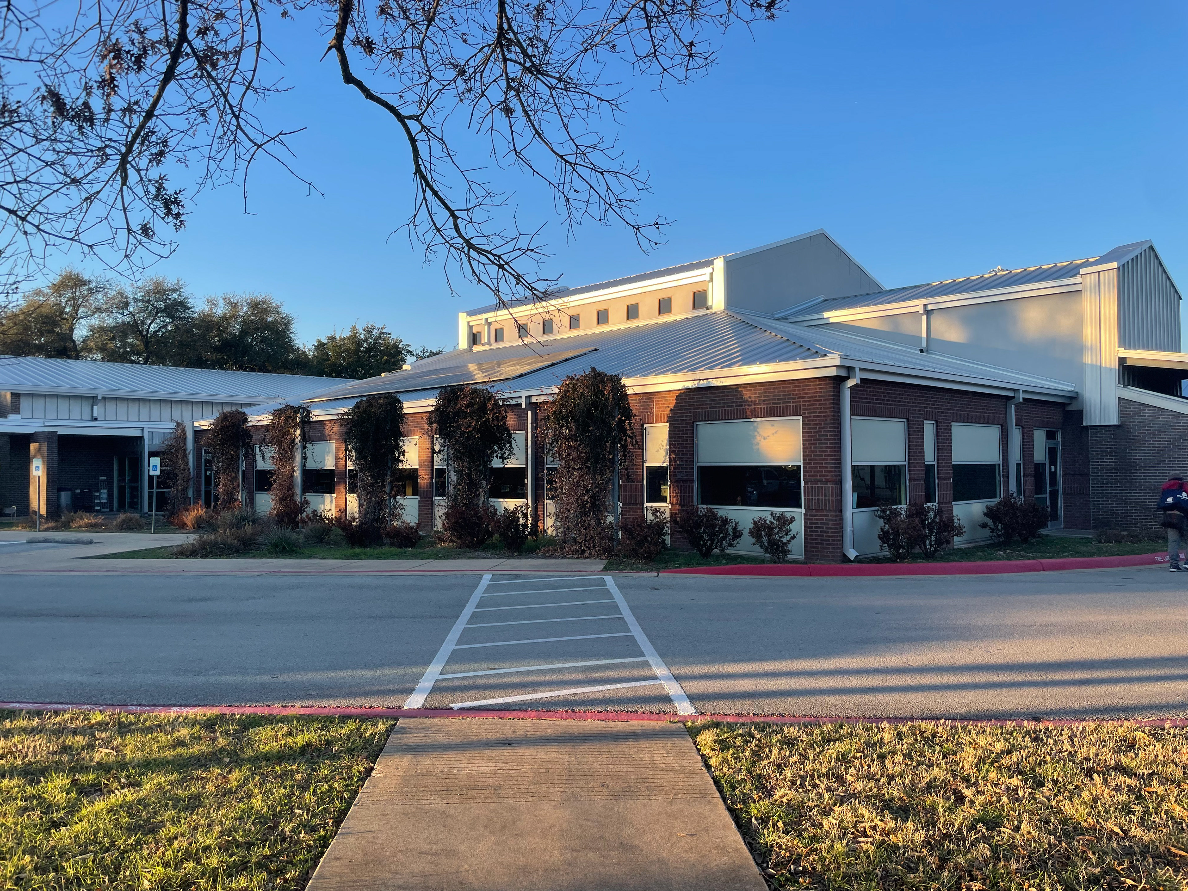
The Spicewood Springs Branch.
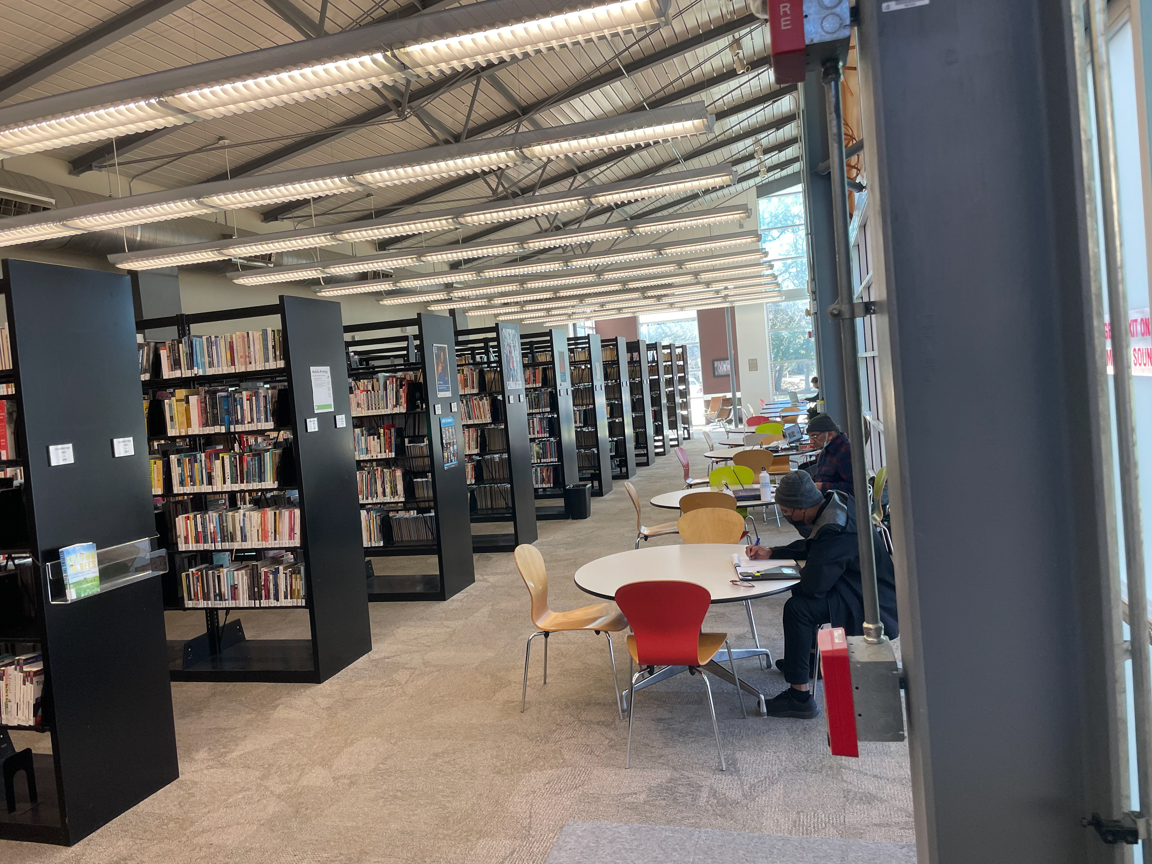
Work/Reading area.
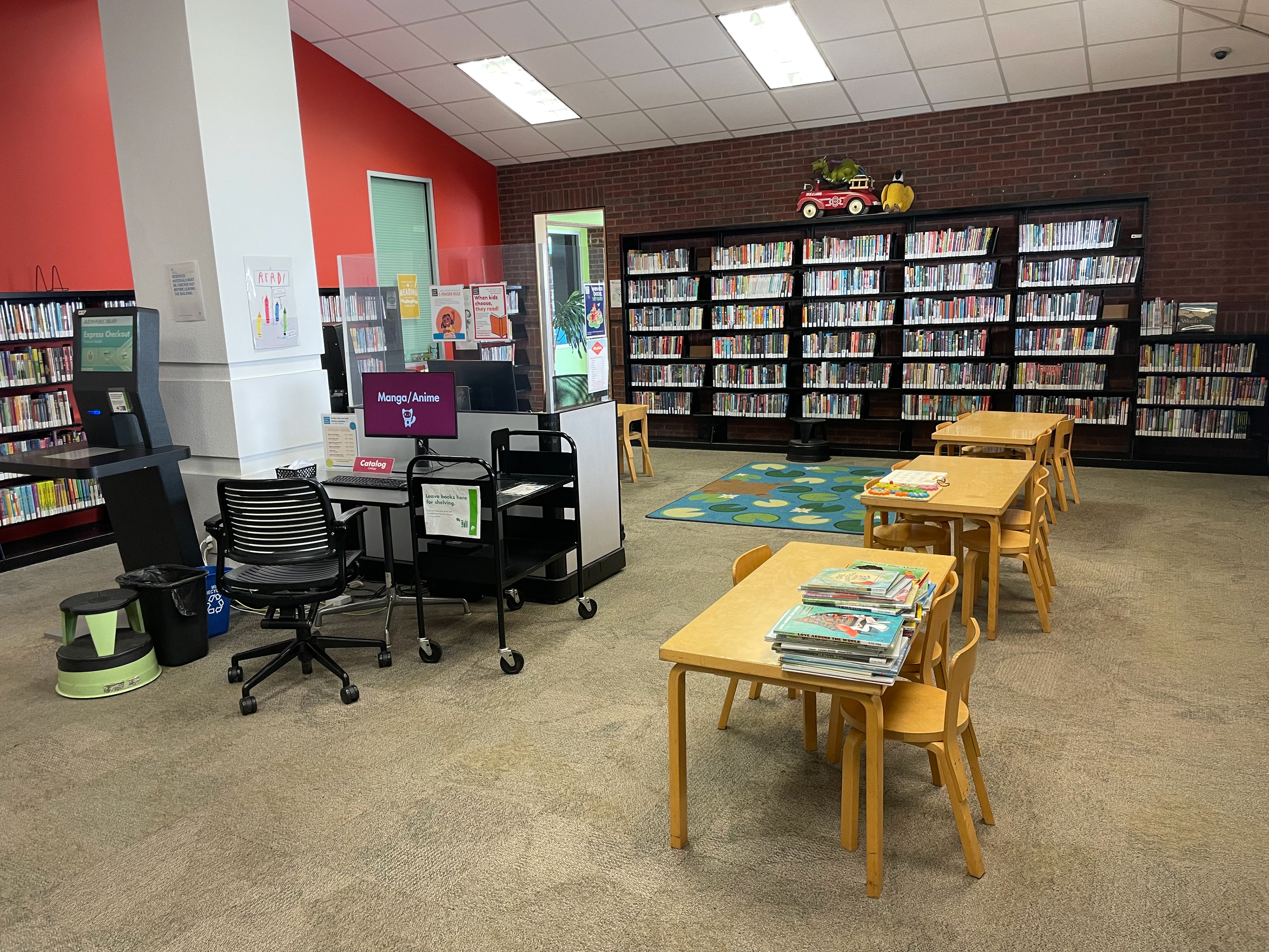
The kids area.
Brand Strategy:
After conducting research and gathering all of my information, it was time to create a proposed brand strategy where I identified a proposed purpose & value, target audience, voice, and position for the Spicewood Springs Branch.
Wordmark(s):
Proposed wordmark(s) were then created to show how my proposed wordmark would look cobranded with the Austin Public Library logo and how it would look on its own. One main wordmark was created, while other variations were also created.
Colors:
A proposed color palette or theme was also created, with each color having its unique name, what it represents, and how much each color is used.
Typography:
A typeface was also chosen as part of the proposed visual identity and displayed and explained why and how it represents the Spicewood Springs Branch.
Illustrations:
Illustrations were created to go along my proposed visual identity while also serving as an important symbol and how the illustrations can be applied in different applications and ways.
Applications:
Finally, it was time to see how my proposed visual identity would present itself in the real world through mockups.
All of the proposed brand strategy, wordmark(s), colors, typography, illustrations, and applications were gathered and put into a slide deck covering my proposed visual identity of the Spicewood Springs Branch. More information can be found here.
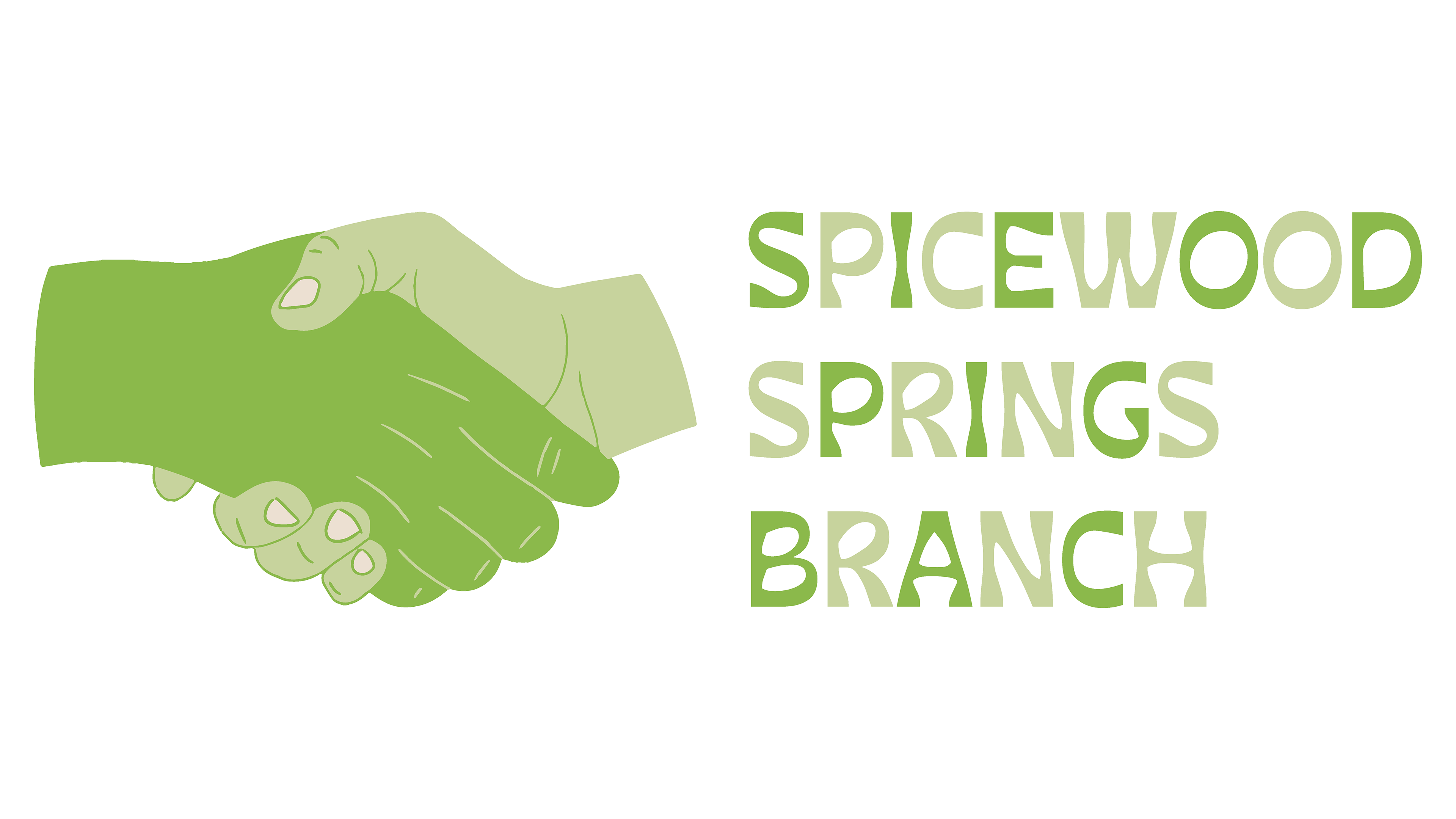
Main Proposed Wordmark for the Spicewood Springs Branch
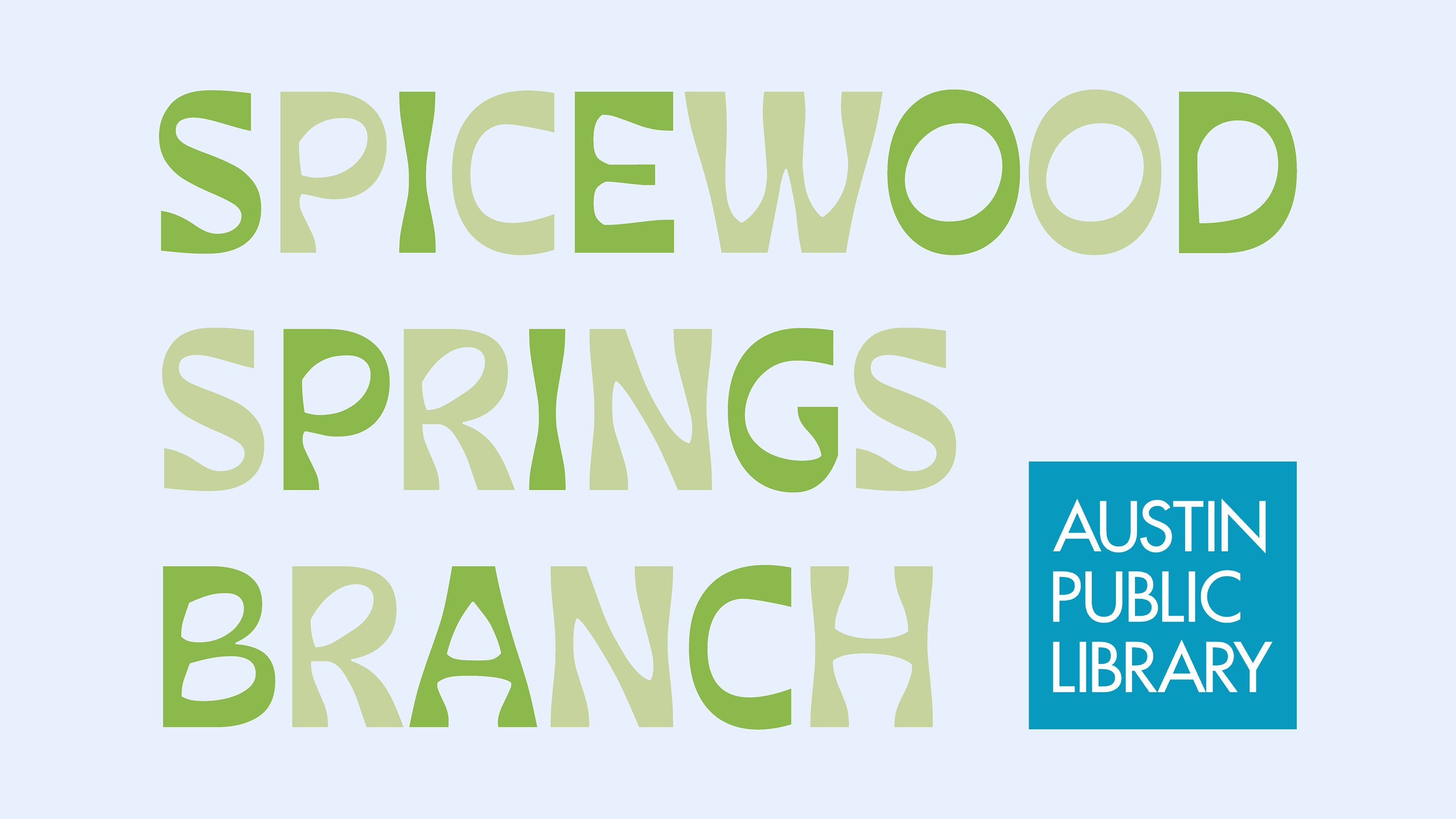
Proposed Cobranding Workmark with the Austin Public Library Logo

Other Proposed Wordmark Variations
More Proposed Wordmark Variations
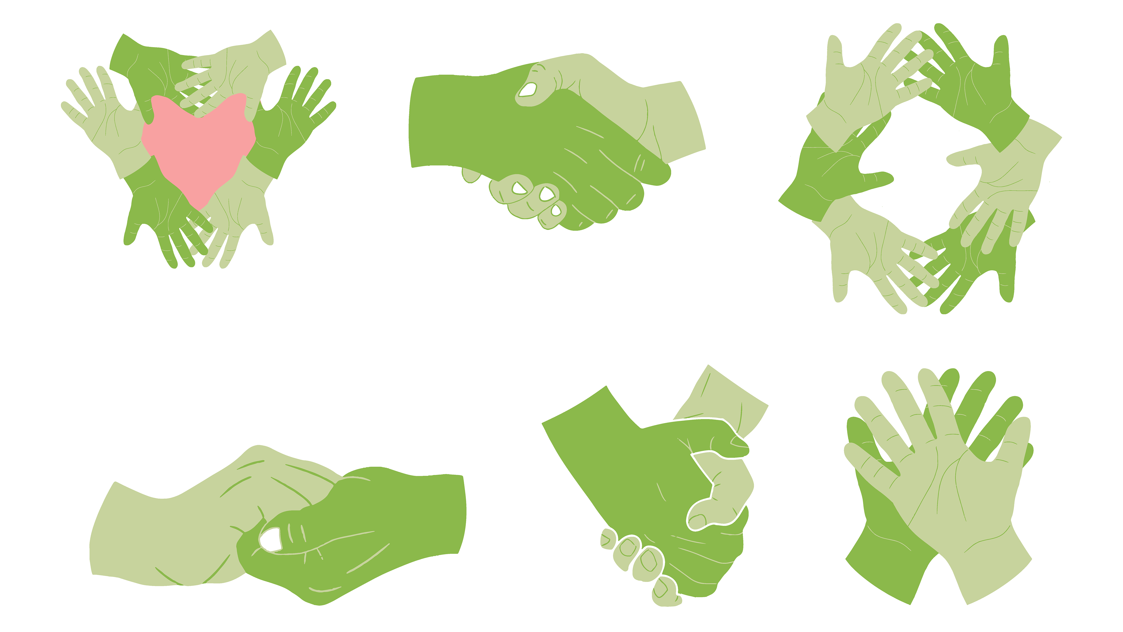
Hand-drawing Illustrations to Represent the "Values" of the Spicewood Springs Branch
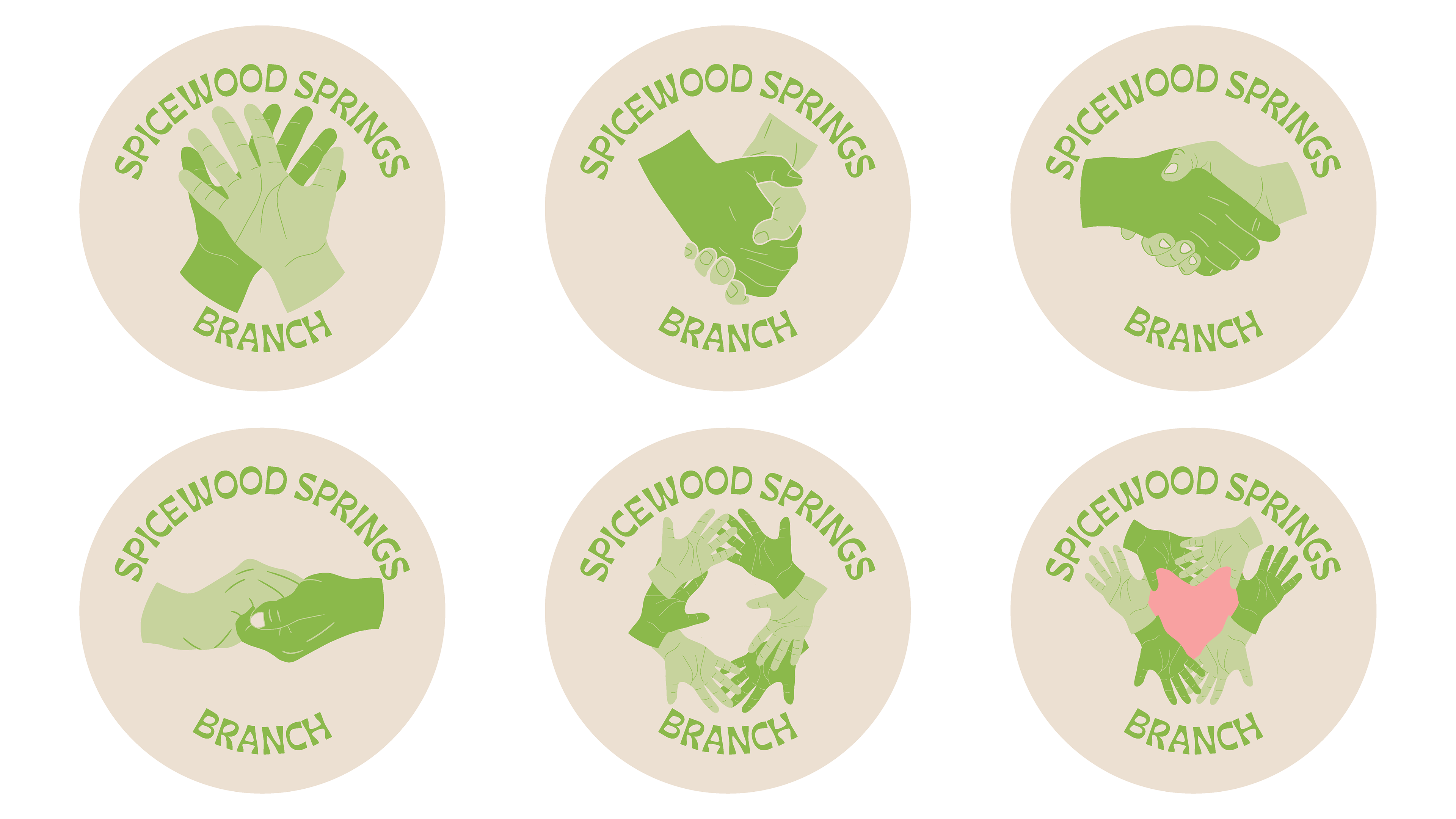
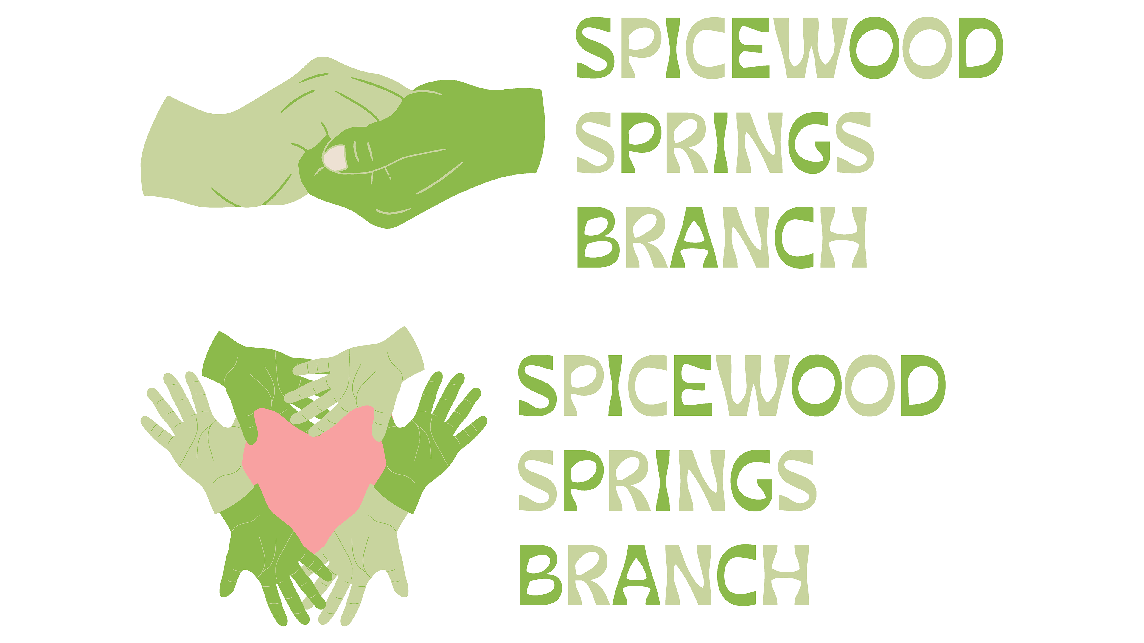
More Proposed Wordmark Variations and the Layout for the Sticker and Button Designs

The Colors Used to "Represent" the Spicewood Springs Branch and How Much Each Color is Being Used
Creating and Making My Brand Extensions for My Proposed Visual Identity:
It was then time to extend my brand or proposed visual identity, create physical or online stuff displaying my proposed visual identity, and extend it to different applications.
Results:
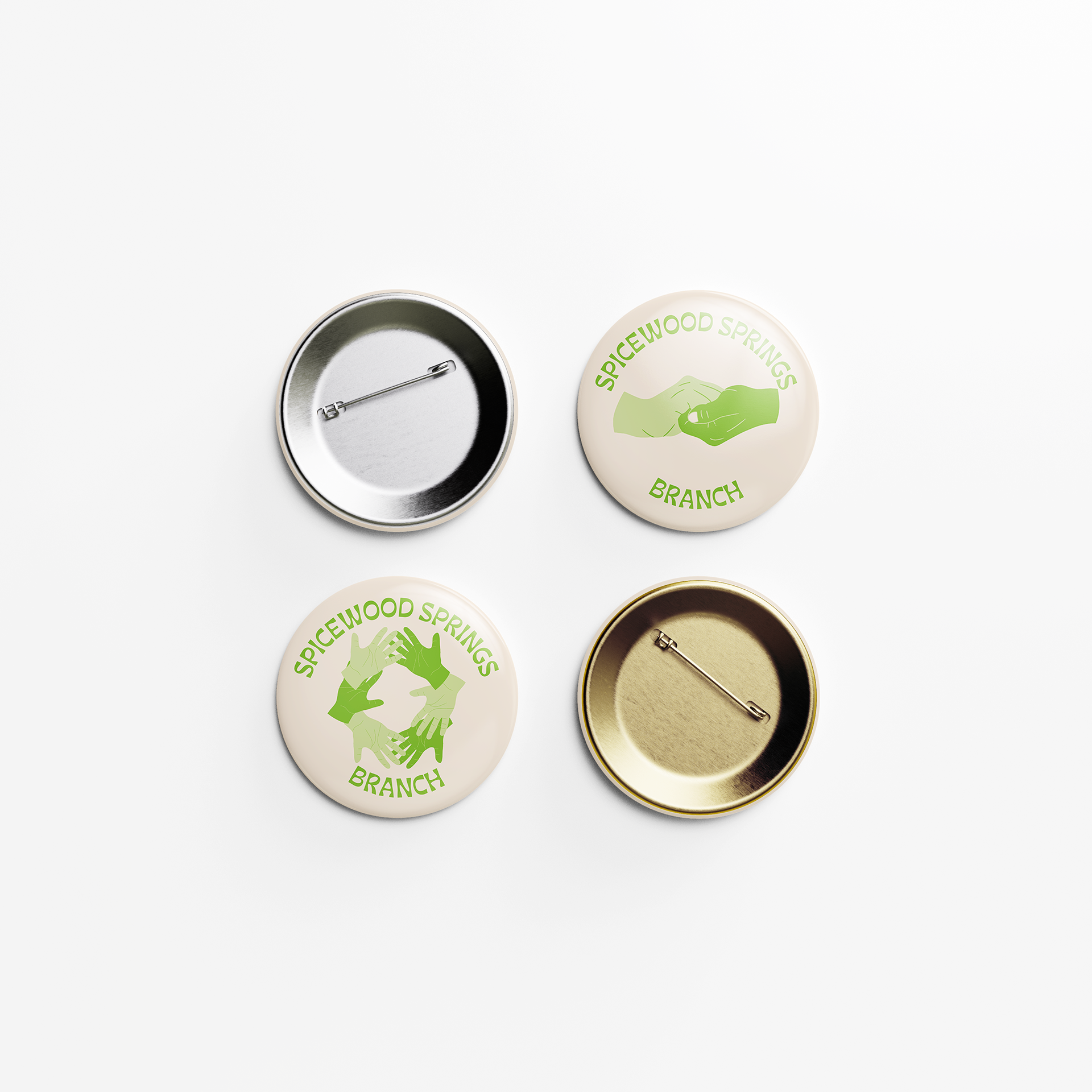
The final results of extending my brand were buttons, stickers, genre signs, and a screen saver.

Buttons showing either just the hand illustrations, the wordmark, or the hand illustrations with the "values" of the Spicewood Springs Branch. Colors are different because it was riso printed.
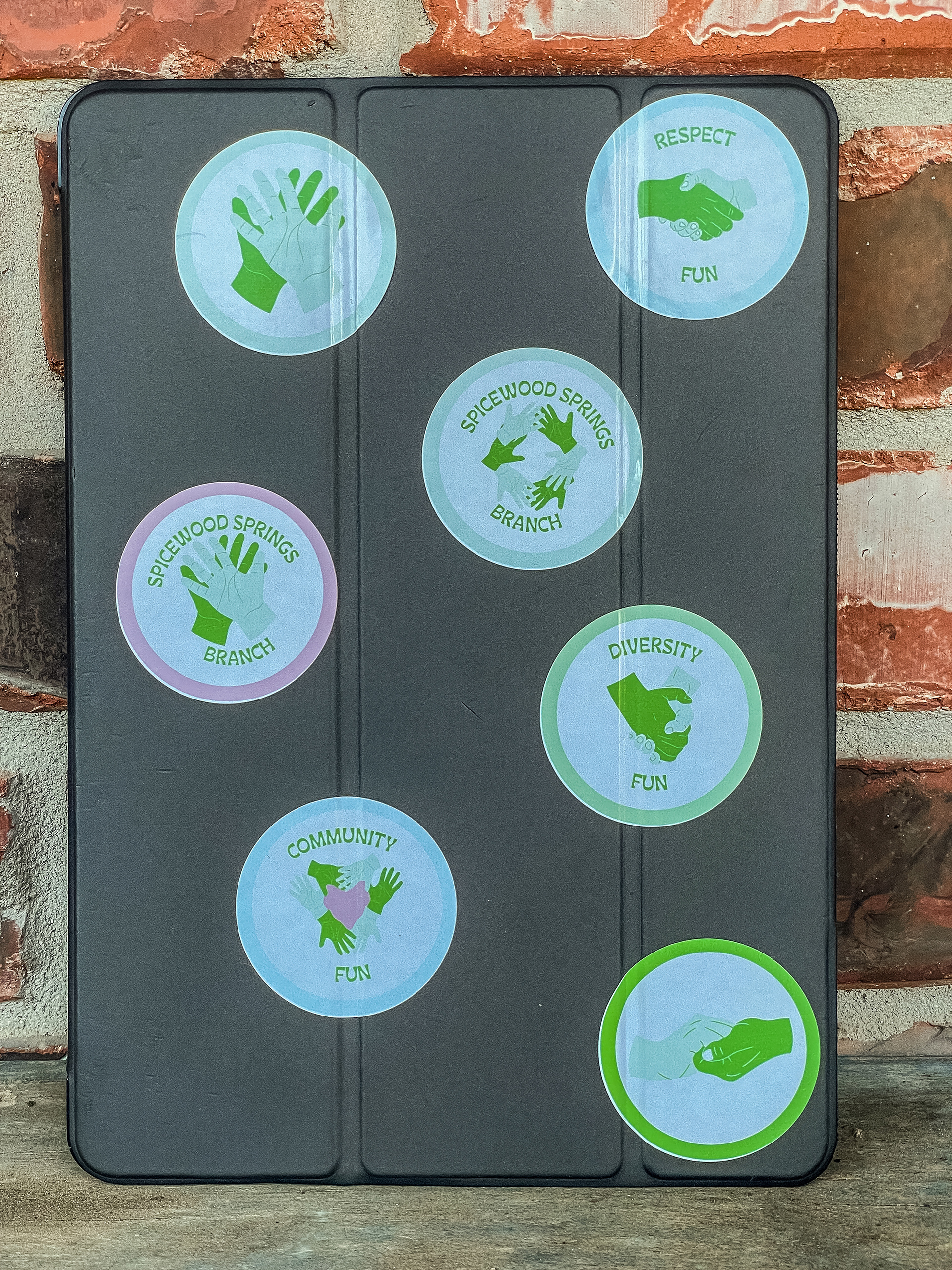
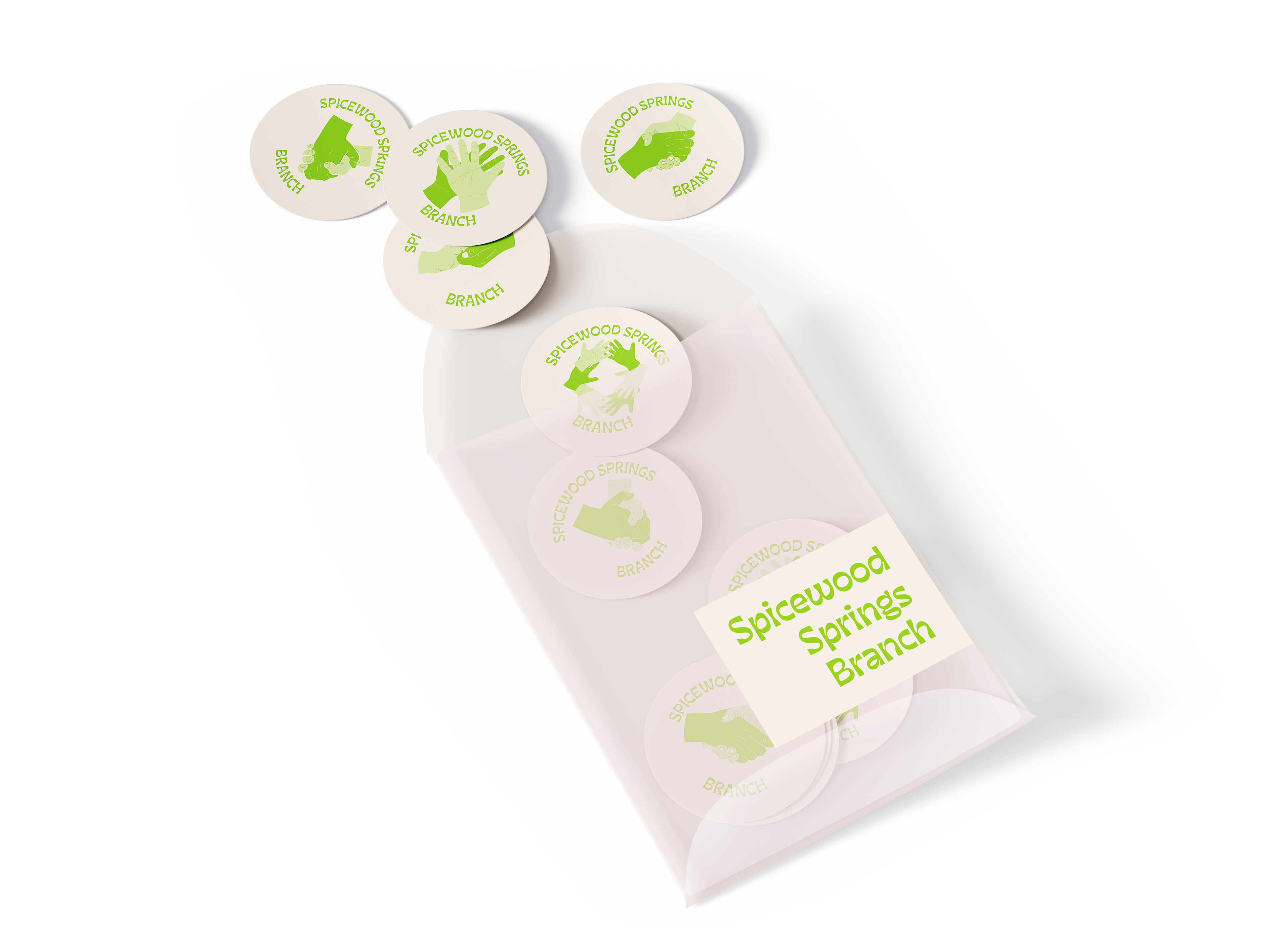
Stickers showing either just the hand illustrations, the wordmark, or the hand illustrations with the "values" of the Spicewood Springs Branch. Colors are different because it's using riso colors.
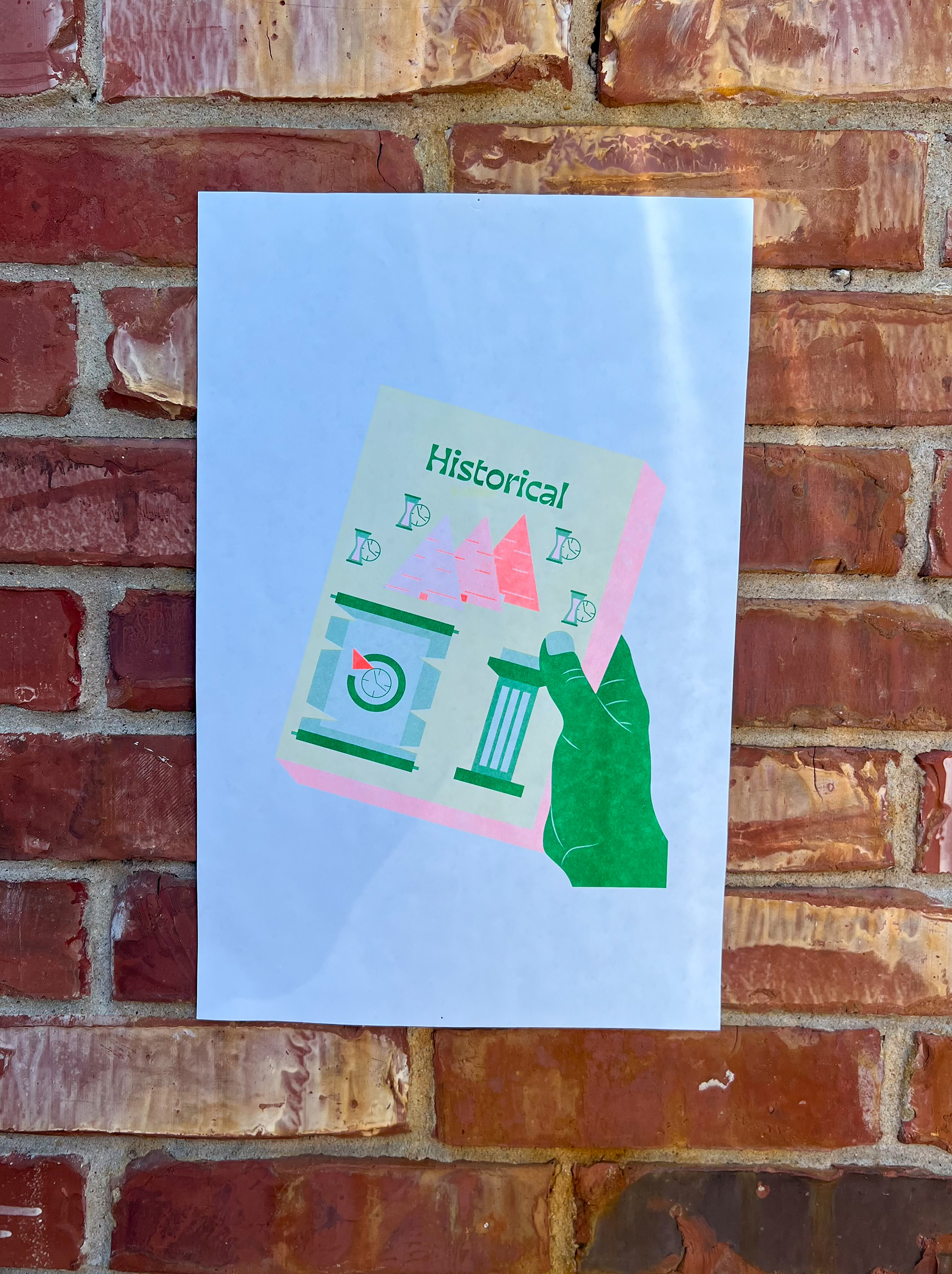
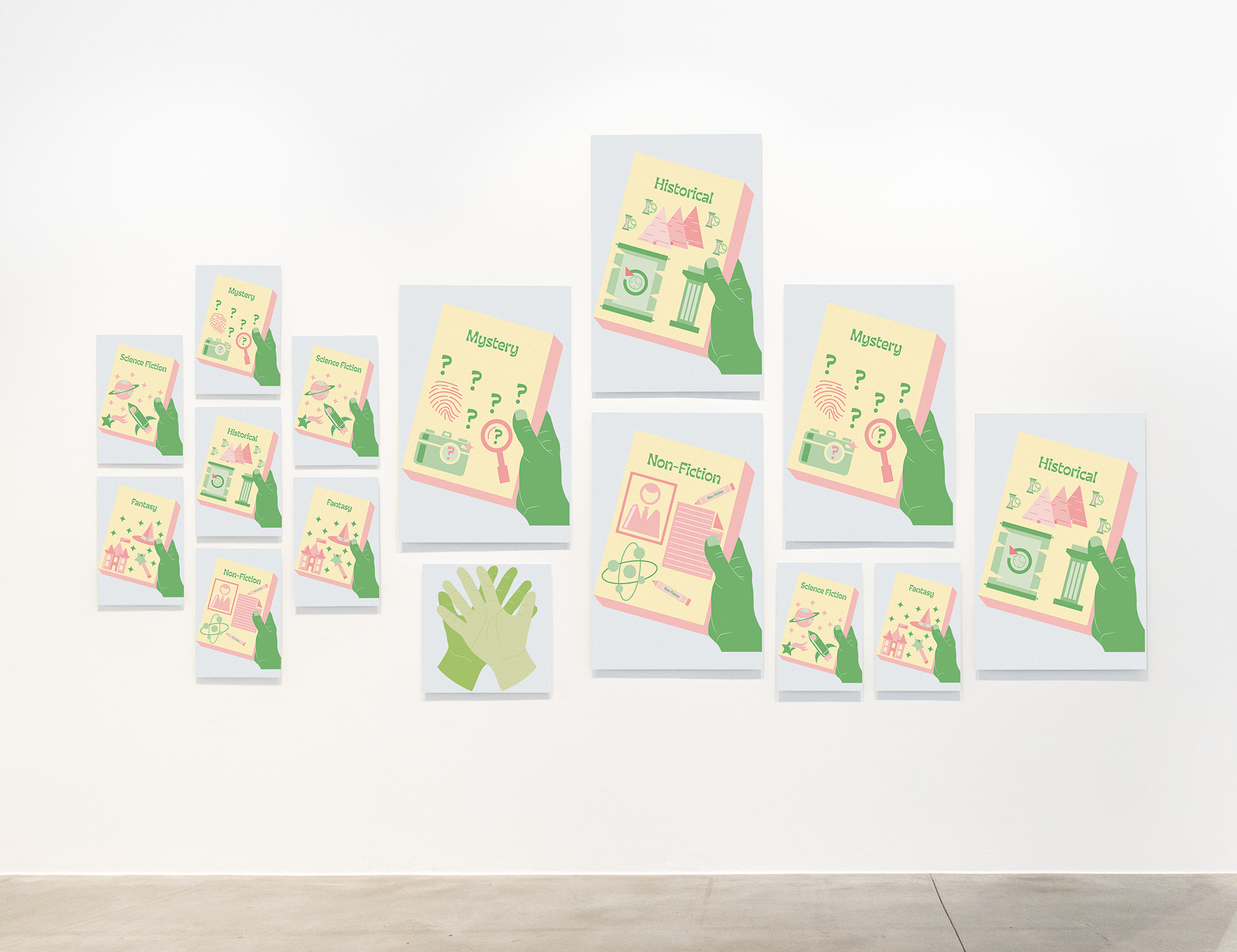
Genre poster showing some of the different genres at the Spicewood Springs Branch. Colors are different because it was riso printed.
Screen saver animation for the computers.
Check out the story of the Spicewood Springs Branch.